Solutions at Work

Summary: Solutions at Work, a nonprofit in Cambridge, MA, faced significant challenges in engaging potential donors online. Their outdated website and fragmented design lacked alignment with their mission to foster empowerment and dignity for underserved populations. My role was to modernize their online presence while keeping the focus on user experience and ethical communication.

Tags: UX Design, UX Copy, User Research, Graphic Design, Technical Administration

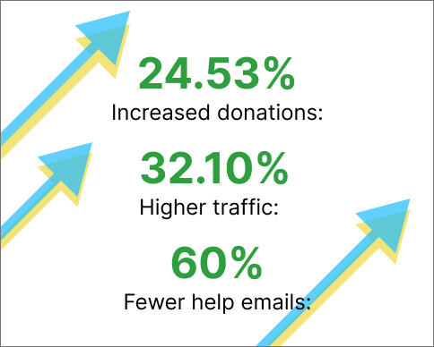
24% increased donations, 32% higher traffic, 60% fewerhelp emails.
A before and after of the website homepage.

Empathy Phase: Understanding User Needs

Before beginning the redesign, I focused on deeply understanding the needs of two key user groups: donors and beneficiary. For donors, the goal was to ensure that the website instilled trust and made donating as intuitive as possible. For the beneficiaries, it was about enabling them to easily locate resources.

To achieve this, I conducted a heuristic evaluation of the existing site and interviewed colleagues about pain points. I also reviewed competitor websites to identify patterns and best practices. A critical insight from this phase was that donors respond more positively over time to messages of empowerment and impact rather than guilt-driven narratives. Guilt-driven narratives, besides their inherent unethicality, only encouraged one time donations in the majority of users. In addition, I confirmed that outdated content and poor mobile usability were major deterrents for potential donors.

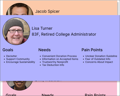
A few of my personas that I created.

Define Phase: Framing the Problem

I aimed to answer the question: How might we create an intuitive, accessible, and empowering online experience that encourages donations and supports the organization’s mission?

From my previous work, I identified these core problems:

  • The outdated website design hindered trust and engagement with donors.
  • The information hierarchy and lack of information scent made critical details (e.g., how to donate) difficult to find
  • The site wasn’t optimized for mobile, despite significant mobile traffic.
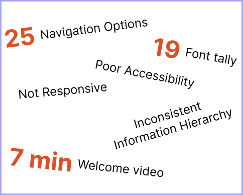
A list of issues I uncovered with the original website.

Ideation Phase: Exploring Solutions Beyond the Obvious

Rather than jumping into a direct redesign, I took a step back to consider the broader user experience. I explored multiple concepts, focusing on ideas that would emphasize trust and impact while reducing friction in the donor journey.

Based on my findings, I decided to limit header options to avoid cluttering the navigation. I also reframed the website's messaging to celebrate the positive impact of donations, aligning with the organization’s mission and donor values.

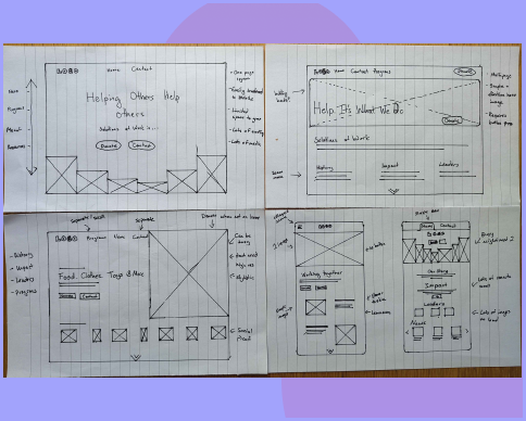
I created wireframes and low-fidelity prototypes, which I shared with staff and test users to gather feedback. These iterative sessions helped me refine solutions, such as emphasizing key calls to action and simplifying the mobile interface to reduce cognitive load.

4 of the wireframes I created for the prototypes

Prototype and Test: Validating Solutions

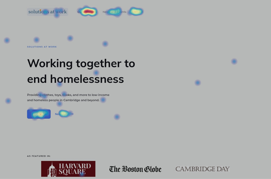
Using the feedback gathered during ideation, I developed a high-fidelity prototype using Figma and conducted further internal user testing. Then, I created and published the website using in WordPress. After installing Hotjar to track user metrics, I used A/B testing to compare different layouts and styles, focusing on metrics such as bounce rate and click-through rate.

One critical test involved redesigning the donation page for mobile users, as many were scrolling up and down searching for information. The streamlined version reduced the bounce rate by 11%. Another test addressed confusion around navigation, where users mistook headers for buttons. Adjustments to the header style clarified the interaction, reducing misclicks.

A photo of the introduction, methodology, and participants of the study.

Deliver Phase: Implementing and Measuring Success

The final solution included a responsive website with a clean, user-centered design. I implemented a design system to ensure consistency and scalability for future updates. Post-launch, I monitored user behavior with Hotjar, making iterative improvements based on data-driven insights.

The results speak to the success of this approach: a 24% increase in donations, 32% higher traffic, and a 60% reduction in support emails. These outcomes demonstrate how thoughtful, research-driven design can directly impact both user experience and organizational goals.

24% increased donations, 32% higher traffic, 60% fewerhelp emails.
A banner which reads 'Examples of Strategic Decisions'.

Redesigning vs. Temporary Fixes

  • Challenge: I was initially tasked with updating minor elements of the website's outdated design.
  • Decision: While I implemented necessary temporary changes to improve functionality immediately, I proposed and executed a complete redesign based on user research, ensuring long-term usability and alignment with the organization's goals.
  • Impact: The new design not only improved mobile compatibility and accessibility but also led to a 24% increase in donations and a significant reduction in support emails.

Streamlining the Navigation Bar

  • Challenge: A request was made by administration to add non-essential items to the navigation bar, potentially cluttering the interface.
  • Decision: I respectfully disagreed and advocated for a minimalist approach, focusing the navigation bar on high-priority actions like donating and learning about the organization. I backed this decision with user research showing that simplicity drives engagement.
  • Impact: The streamlined navigation improved clarity and ensured donors could easily find and complete critical actions, resulting in increased conversions.

Creating Direct-Link Donation Pages

  • Challenge: The organization needed additional donation pages for specific campaigns, but cluttering the main navigation with extra pages risked overwhelming users.
  • Decision: Instead of making the pages public-facing, I designed them to be accessible only via direct links. This kept the user experience streamlined while allowing targeted campaigns to thrive.
  • Impact: The campaign pages generated engagement from specific audiences without detracting from the main donation pathway, preserving the simplicity of the user journey.

A banner which reads 'creating the design system'.

To ensure the website effectively supported the organization’s mission, I began by studying established design systems like M3 and Shopify. While the scope of our site was smaller, these systems inspired scalable, user-focused principles that guided my decisions.

The website’s primary goal was to encourage donations, so I focused on creating a welcoming and accessible experience. My research included a review of over 12 partner organizations to understand visual and content strategies that resonated with similar audiences. Key design decisions included

  • Visual Identity: Used bright, warm colors and rounded containers to create an approachable and optimistic aesthetic.
  • Accessibility: Ensured high text contrast (7:1 minimum), alt text for all images, and a reading level appropriate for a broad audience.
  • User Celebration: Targeted donors as the primary audience with positive, empowering language over guilt-driven messaging.

Additionally, I prioritized responsive design, ensuring the layout worked seamlessly across desktop, tablet, and mobile devices.

Although creating a formal design system might seem ambitious for a small nonprofit, this project was an invaluable opportunity to deepen my expertise. By studying industry-leading systems and adapting them to our needs, I not only improved the website’s usability and consistency but also grew significantly as a designer.